
- Darling Dots
- Hello My Name is
- Right This Way
- Mod Borders
- Behind the Camera
- Calendar Basics
- Typewriter Alphabet
DIE-NAMICS
- Traditional Tags Stax
- Stacking Stars Die-namics
- By the letters
- By the Numbers
- Bottom Line Alphabet
- Bottom Line numbers & symbols
- Highrise alphabet upper
- Highrise alphabet lowercase
- Harlequin
- Notebook edge
- Accent it-Flags and Tags
- Accent it-Labels & Tabs
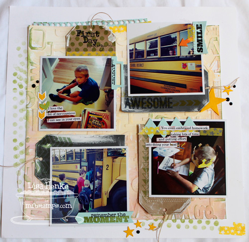
I just love those tags in the sketch, so the Traditional Tags Stax was the first thing I grabbed. Since I was working with my 4x4 Instagram pics, I used one of the larger tags to tuck behind each of the photos. I cut 4 tags, two each in MFT Kraft cs and Steel Grey cs. I then added some stamping to make each tag a little different.

Since my background (which I will show you in a bit) was a creation of mixed media, I went ahead and added swipes of white paint to all of my tags to keep the flow and balance on my page. I added that in last. It just needed something else.

I actually typed up my journaling on this page. Normally I always just add my journaling in my own handwriting, but with so much else going on with my layout, I decided to keep the words simple and clean. I cut apart the words and inked the edges a bit with some Electric Red ink.
Those little arrows are from Right This Way and I stamped them in Lemon Drop ink and took an extra minute to cut them apart. I then rand a stitch down the center. That sweet little heart was sitting on my desk and thought it was a nice touch next to my journaling. I do adore this photo.
You can also see I added more Darling Dots along the left side of my page. I inked it once in Gumdrop Green ink and stamped it repeatedly to get a distressed and random look and feel. I also did this along the bottom right side to balance everything out.
Below is a Steel Grey tag with some Mod Border stamped in Gumdrop Green ink. I only stamped to top of the tag, since the rest was almost covered by the photos. I cut an arrow label from Accent it-labels and tabs in Sno Cone cs and added sentiment from Behind the Camera.

Moving on to the right side of my layout. You can see I stamped more arrows from Right this Way in Lemon Drop ink onto a Steel Grey tag. I then added the word AWESOME from Hello My Name Is with Black Licorice Ink. It really was awesome to see my little guy smiling so big from the bus window. He was so excited to ride the bus with his big brothers.

I used the small arrow from Accent it-Flags and Tags to help show it off. The SMILE stamp is from Behind the Camera.

Finally, you can see my big boy, Kindergarten working on some homework. I am pretty blessed to say that all my boys embrace homework and get it done. They know they can't do the fun stuff until the homework is done. I'm not saying they don't grumble about it, but really, all three just do it and homework time is not as big of a battle as it could be. I guess his big brothers set a good example.
I stamped these cool arrows from Mod Border (you have to get this stamp set....it is just so cool and works for so many projects. I love it and it hasn't left my desk since release week). I added some stitching around the edges of my photo. I added more typed journaling and a bit of the Harlequin Border in Sno Cone.
After I had the tags and photos in place I took a step back to see what was missing. I always do this with a layout and find it the perfect time to add little bits and pieces to balance the layout. I cut some small stars in Lemon Drop cs, and added some black self-adhesive dots. I also needed a touch more of Sno Cone color towards the top, so I tucked in a strip of Notebook edge. Plus it tied in with the school theme.
You'll also notice I used some washi tape here and there on my layout. I'm trying to use more of this fun accent. I've had it forever and for some reason am shy about using it.


AND now......if you can hang on a bit more, I've got a quick how-to on how I created my fun background. It's also a great way to use up some of those extra letters and number scraps you might have.
Creating an Ombre Background
In fashion, the term ombre refers to the graduation of color in a garment. The word usually refers to a garment that is monochromatic but has a graduated variation in the saturation of the color. It's fun to translate this technique onto paper.
Supplies
- alphabet dies (for mine I used By the letters,By the Numbers, Bottom Line Alphabet, Bottom Line numbers & symbols, Highrise alphabet upper, Highrise alphabet lowercase).
- white card stock
- Die cut machine
- white acrylic craft paint
- paint brush
- paint palette (anything to hold and mix paint in, will work)
- MFT Re-fill ink
- Liquid adhesive
- paper snips or trimmer
- If you don't have letter scraps, just use your dies and cut a bunch out. It doesn't matter what letters, size, or font. You want a good mix of size and shape. Be sure to cut some numbers, too. I just pulled white cardstock scraps from my desk and used those up. You'll want white, because you'll be painting over them.


3. Cut a white card stock base10x10 inches, and then begin laying out your numbers. You want a random pattern. Turn the letters in all different directions, you are looking for a collage-like look. Makes you are mixing up letters and numbers and different sizes. There is no right or wrong way to do this, just fit them on.


6. Go ahead and trim off the letters and number that are hanging off the edge of your page. You can use a paper trimmer or your paper snips.

7. Next comes the fun part. I really love using my MFT re-fill inks to color up paint. I'm using Lemon Drop and Wild Cherry here today. I want my colors to go from pale yellow to an orange. That is why I am adding in the Wild Cherry. ( You can achieve the Ombre look with only 1 color of re-fill ink.)

8. I start with white acrylic paint (from any craft store) and add 3 or four good squirts to a paint palette. Add 1 drop of the Re-fill to your first dolop of white paint. The next slot, should get two drops of ink, and your next slot should get 3 or 4. You are creating a darker shade of the same color with every drop you add.

9. Mix the paint and re-fills together. At this point, you can add more ink, to get the desired color you are looking. If your color is too dark, then add more white acrylic paint to lighten it up. I love this technique, because there really is no wrong way to do it. You just need to play around a bit with your colors. It is FUN!

10. Begin painting your letters, starting at the top with your lightest color. Move on to the next darker color as you move down. Notice at the top, my letters are still almost white.

11. Make sure your darker colors are toward the bottom. At the bottom of mine, you 'll see it's a nice, darker, orange color achieved by mixing both Lemon Drop and Wild Cherry re-fill ink together.

I hope you'll give this a try. Have fun and play around with your colors. Be sure to order your MFT Re-fill inks when you order your Ink Pads. They aren't just for keeping your ink pads juicy.
MFT Shopping list:
 |  |  |  |  |
 |  |  |  |  |
 |  |  |  |  |
 |  |  |  |  |
 |  |  |  |  |
 |  |  |  |  |


Thanks for sharing the tutorial Lisa!! Love the background you created!! This is a fantastic page!!! Great take on the sketch!
ReplyDeleteSuch a beautiful layout Lisa! Love all the darling photos and your attention to detail! The background looks fabulous ~ thanks for the tutorial!
ReplyDeleteWhat a great layout and precious memories. I love how you used so many different dies & stamps. I like to do that also.
ReplyDeleteThanks for sharing the tutorial.
OH goodness Lisa! This is darling! I love how creative you are with the letter die-cuts (I have to try that!!) and the photos are darling!
ReplyDeleteOh wow! Stunning background, love your lo! It was fun playing along this month.
ReplyDelete